Highland Pet Supply Redesign
In this project, I redesigned Highland Pet Supply’s website. Highland Pet Supply is a store that offers pet supplies and trainings for pets, as well as creating a social space for pets and owners to be able to meet through their events.
Role
UX/UI, Research
Tools
Figma
Client
Class Project
Timeline / Year
2 Weeks / Fall 2021
Problem:
Highland Pet Supply is looking to jump into the world of e-commerce. They need a UX Designer to redesign their website so it’s able to handle this transition.
Solution:
A website experience that uses competitive research and intuitive design to create the most streamlined experience.
Discovery and Research
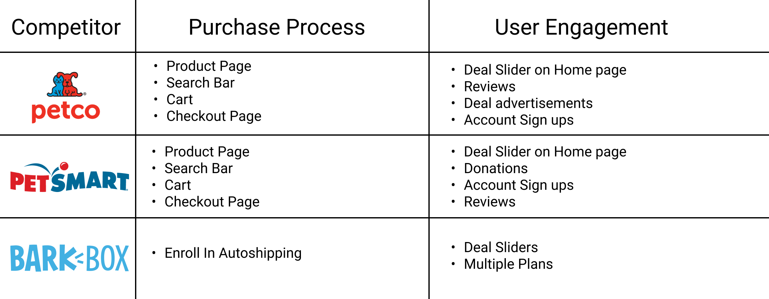
Competitive Analysis
In my competitive analysis, I noticed a lot of patterns, but I focused on 2 key insights:
Competitors would often bring attention to ongoing deals. This kills 2 birds with 1 stone, showing that the users is in a store, and getting them excited that they’re going to be saving money.
Carts were often used to keep track of users’ desired shopping items. Carts streamline the checkout process so you don’t have to individually purchase each item, and you can purchase them in bulk later on.
Card Sorting
Card sorting was an essential part of the process to show what ways users categorize the items we sell on our website. I found that users categorize our items by animal rather than product type. This, combined with the fact that our competitive analysis also showed the same results confirmed that the website must be organized by pet and not by product.
Sketching and Ideation
User Flows
Due to card sorting results, I realized that users sorted product categories by pet type like dogs vs cats, rather than product type like food vs habitats.
I used this data and my competitive analysis to come up with a User Flow. The green points represent the beginning and end to this process.

Sketches


Home Page Sketch
In my sketches I used the competitive analysis and card sorting results to come up with a layout that categorizes our items based on pet type.
I also added a gallery slider to show off sales on products to make the website feel lively.
Navigation Sketch Ideation
I modified the primary navigation to include the website features, like the products and events. This was a big change from the live website, which only provides options for payment.
This will give returning customers a quick and easy way to get to their chosen products, reducing the time of the checkout process and reducing bounce rate. This insight was supported by my competitive analysis.
Digitization and Testing
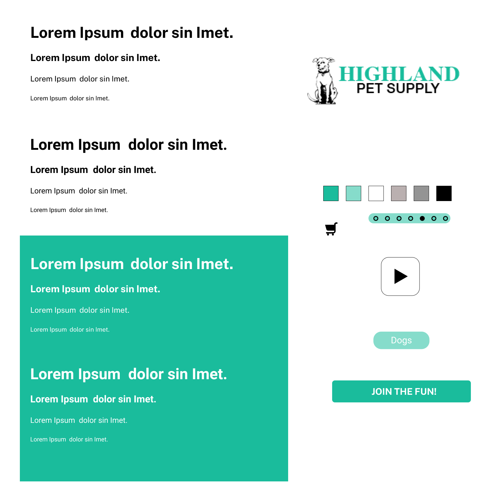
Style Guide
I decided to base my style guide on the existing palette so could enhance what already existed without altering the visual style.
Wireframes


Events Section
I added an events section to distinguish the types of services that Highland Pet Supply offers.
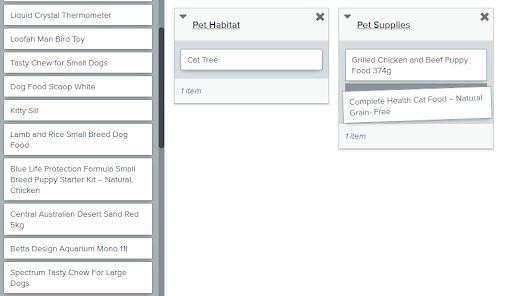
Pet Supplies Section
Digitalized version of the Pet Supplies sketches


Product Page
I included a product page to help convince careful buyers that our products are worth their money. Reviews help users feel like our items are high quality and pictures help users envision our products so they don’t spend too much time thinking and talking themselves out of a purchase.
Checkout Summary
I added a checkout summary page because it’s an essential part of the add to cart checkout flow.
Prototyping and Mockups
Prototyping
Test Results
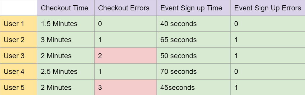
In my user testing results, I found that all users were able to complete the event sign up and checkout flows very quickly.
The source of the errors in the Event Sign up section was that when the users got to the Events Sign up page, the screen looked very similar to the previous page, so they didn’t realize that they had changed pages.
The source of the errors in the checkout process was at 1 specific point. After adding an item to their cart, users didn’t realize the next step was to go to their cart. Some users expected the website to get a popup that offered to take them to their cart. Others expected a popup that told them that their item was added to their cart.
Mockups
For my mockups, I worked on the Events Sign Up flow, modifying the Events Sign Up page to look different than the previous page. I made sure to theme my mockups appropriately too! 🐶


Moving Forward…
Next Steps
Add feedback for adding an item to your cart
Conduct more user feedback
Enhance CTAs (Icons, larger buttons, make buttons stand out more)
Lessons Learned
Every user action requires user feedback.
Important buttons should be displayed large and take a lot of the user’s attention
Dogs make everyone happier!
