Twitch.tv Private Chat Rooms
In this project, I worked with a small team to create a ground breaking new feature for Twitch. Twitch is the dominant livestreaming outlet, bringing users to content creators and filling our lives with fun.
Role
UX/UI, Research
Tools
Figma
Client
Class Project
Timeline / Year
2 Weeks / Fall 2021
Problem:
Twitch.tv is losing revenue and user engagement because users will use external applications to enjoy twitch together.
Solution:
A private chat experience that lets you talk, text, and customize your experience.
Discovery and Research
User Surveys and Interviews
In our User Surveys and Interviews, we learned a lot but noticed 2 key insights.
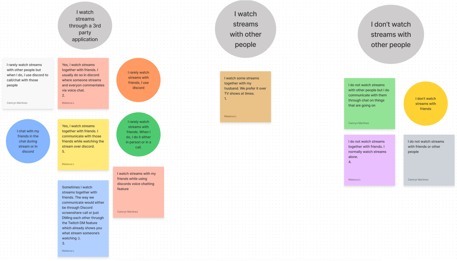
69% of users enjoy watching streams with friends
88.8% of those users watch Twitch through 3rd party applications
This means we have identified a user need that can be fulfilled to increase user engagement.
Sketching and Ideation
User Flow
With the key insights gained from our Surveys and User Interviews, we created a preliminary User Flow.

Sketches

Private Chat Tabs
I chose to represent the Private Chat Room with Tabs for familiarity.

Settings Menu
To customize your Private Chat Room, I added a settings menu that covers the text chat but not the video, so you never have to take your eyes off of the stream.

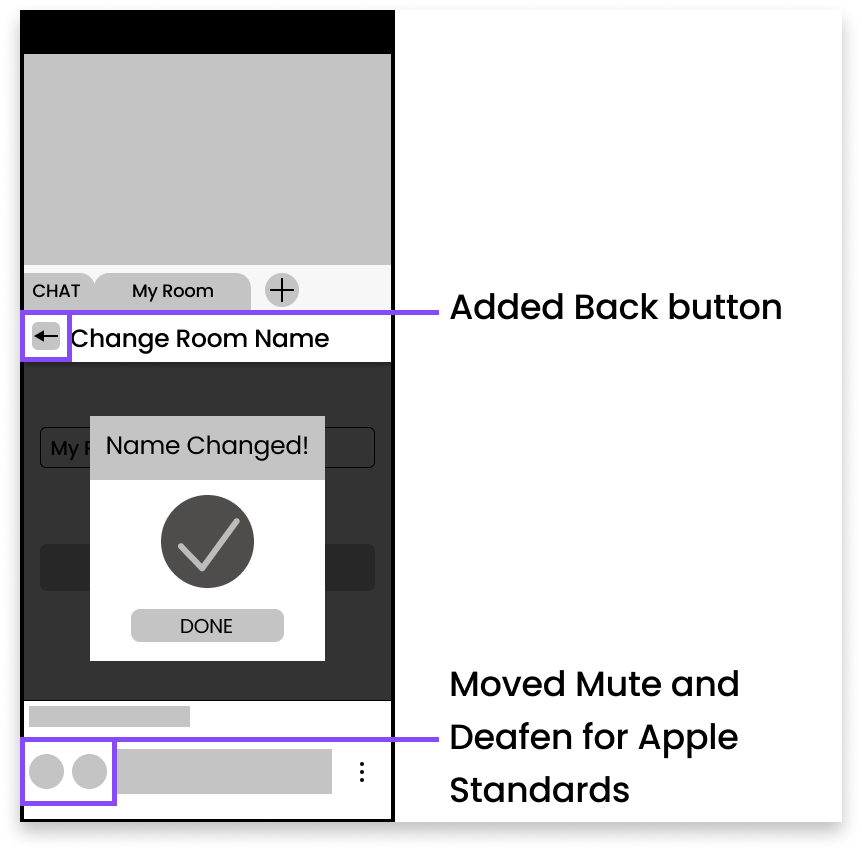
Mute and Deafen Buttons
Voice chat can get hectic. Mute and Deafen buttons are essential to the experience to not get out of hand.
Digitization and Testing
Style Guide
I decided to base my style guide on the existing palette so could enhance what already existed without altering the visual style.

Wireframes

Prototyping and Mockups
Prototyping
Test Results
As you can see in the green we have successful test cases, and in the red we have our unsuccessful test cases. We decided to go with a very strict test to force problems to come out earlier in development, so we didn't have to find those errors when they had developed into something worse. As a result, 0 errors were tolerated in this test, and many testers got caught up by those errors.
Also, most of the confusion and therefore most of the red, came from opening and closing the settings menu.

What Slowed us down?

Users spent a long time looking for the Settings Menu

Users felt it was hard to tell what room you were in, as there was no feedback showing that.

The users felt that leaving the settings menu was slow. Testers often said that clicking the back arrow caused unnecessary slow-down.
Mockups
For our mockups, we resolved these issues.
Moving Forward…
Next Steps
Add a Delete, Leave, Kick from Room feature
Limit the amount of people who can talk
Local volume control that all users can use to change how loud each person is on their end.
Lessons Learned
Users really want to be more social with each other.
Timeboxing really works for me
Project Planning helps keep everyone on track and timelines met