Invisible Strengths App Design
Invisible Strengths is a startup company who was looking for UX/UI Designers to create a design for their app, Invisible Strengths, A social networking app connecting intersectional (BIPOC/LGBTQIA and disabled) candidates in the public health field with inclusive work environments. I worked as the UX Research Lead as well as the UX Team Lead in a team of 4 UX Designers to create the job seeker flow based on data, for the Invisible Strengths app.
Role
UX/UI, Research
Tools
Figma
Client
Invisible Strengths
Timeline / Year
3 Weeks / Fall 2021
Problem:
Invisible Strengths needs a complete job seeker flow that lets the user search for and apply to job from beginning to end.

Solution:
A job seeker view based on a competitive and comparative analysis, user research, user testing, and critical analysis.
Discovery and Research
Initial Client Conversation
In order to understand what our client needed from us, we set up a date and time to come to an understand of who our client was, what their product is and what we would be working on for the next 3 weeks.
The conversation went great and we created a Statement of Work explaining that we would be working on all of the screens for the job seeker flow. We decided that would expressly focus on making sure to follow the Web Content Accessibility Guidelines (WCAG) to make sure that our app was accessible for our audience, intersectional (BIPOC/LGBTQIA and disabled) candidates.
Initial Designs
The Invisible Strengths team started us off with some sample screens. We critically analyzed these screens and came back with these 3 critical insights:
The background of some frames was distracting
The contrast on the text boxes was too low and the font size was too small or too low contrast to be accessible for those with visual impairments
These designs did not follow the Web Content Accessibility Guidelines


Competitive Analysis
We used a Competitive Analysis to decide what features and filter types we wanted to include.
The most exciting part of this Competitive Analysis was that we found that none of our top competitors had their accommodations clearly listed on the job listings. Listing accommodations was one of our goals with our project, so that means we would be able to lead the market in terms of showing accommodations.

Market Research
From Market Research, we could see how many people could benefit from our product and how much potential revenue was possible.
1 in 4 people in the US live with a disability.
Indigenous people have the highest rates of disabilities in the US, followed by Black Americans
Venture capital funding in HR tech doubled from July - November 2021.
Survey
In order to collect data directly from users, we created a survey and distributed it to various groups for marginalized people in public health. We used this data to create an Affinity Map with which we grouped similar survey responses together to record the following key insights:
Users feel that accommodations at their company are unclear.
Users fear being discriminated against due to appearance, ethnicity, disclosure of disability, or sexual identity.
Users feel that there is a disparity in their pay based on their identity.
Users feel that there is a lack of transparency with salary, and they often don’t know their worth.
User Persona
From our key survey insights, we created a User Persona in order to personify our findings into a single data point.
Name
Age
Location
Industry
Job Title
Pronouns:
Disabilities:
Accommodations Needed:
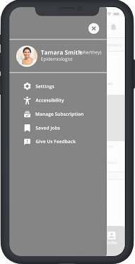
Tamara Smith
30
Cleveland, OH
Public Health
Epidemiologist
She/They
Major Depression (MDD) General Anxiety (GAD)
Flexible deadlines

Sketching and Ideation
User Flows
We then needed to create a user flow in order to organize the job seeking process.

Sketches
Once our user flows were done, we were able to sit down together and do a Design Studio to decide the overall design of our app. We also were able to come up with a list of necessary features to implement, using the data from our competitive analysis.

Digitization and Testing
Wireframes
Once we had created our sketches it was time to digitize our design. Here are some key parts of our design that will make our product unique.
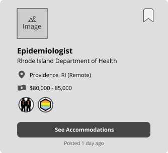
Job Listing
In order to confront our surveyed users’ complaint that they feel like they are being valued less due to their identities, we decided to require that job posters enter a salary with their job posting before they know the identity of their users.
Job Listing Continued
We also added a “See Accommodations” button that lets users see what accommodations a company has available up front. This solves another problem that we discovered in our user surveys, that users felt like they didn’t know what accommodations their company has and are too afraid to ask for them.


Job Description
We also made sure to include all distinguishing features of our app in the job description itself.
Prototyping and Mockups
Prototyping and User Testing
Once we had our wireframes completed, we were able to make a clickable prototype. We used this clickable prototype to generate user data by setting up user tests with multiple users.
For this usability test, we asked our users to find an Epidemiologist job on the app that is full-time and provides the accommodation of flexible scheduling.
While we observed the users perform the task, we were looking for quantitative measures like the number of errors they made and the time it took them to complete the task.
We also took qualitative notes on their reactions and how they felt about the experience as a follow-up.
If you’d like, you can click the button below to view the full prototype on Figma.


Test 1 Results
With the observations we made during usability testing, we synthesized our data and observations into a few key takeaways.
The Good
We noted that users stated they felt the process was in-line with current industry standards and that they were comfortable with it. This made users feel that we were improving on the existing formula.
The Bad
All of our users utilized the search bar to search for the job title in the Home page, rather than the Jobs Page. This was a problem because that search bar would only search the contents of the page it was on, and that page didn’t have any job postings.
The users did not utilize the ‘See Accommodations’ button. One user stated that they believed it was simply a ‘see more details about the job’ button. This told us that users weren’t used to the idea of a pop-up with additional information.
Solution 1
To solve the issue of users getting stuck on the search bar in the Home page, we made all of our search bars global, meaning that you can search for anything from any search bar.


Solution 2
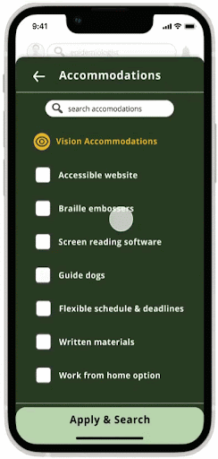
To solve the issue of users no noticing the “See Accommodations” button, we changed the “See Accommodations” button into a list of accommodations offered, listed by accommodation type.

The old Job Listing design

The new Job Listing design
Prototype 2
With these key insights and many more improvements made, we were able to create a new and improved version with a placeholder color!

Stretch Goals
Now that we had completed 1 User Test, and created a prototype using the data from our user tests we had accomplished everything that we had said we would complete in our contract! We finished ahead of schedule, which gave us a lot of extra time to get to work on our Stretch Goal to do a second round of User Testing and create a final Mockup using the second round of data.
User Test 2
For our second user test, we decided to use the same task as we did for the first round, so we could compare the results accurately.
Again, we asked our users to find an Epidemiologist job on the app that is full-time and provides the accommodation of flexible scheduling.
While we observed the users perform the task, we were looking for quantitative measures like the number of errors they made and the time it took them to complete the task.
We also took qualitative notes on their reactions and how they felt about the experience as a follow-up.
If you’d like, you can click the button below to view the Prototype 2 on Figma.

Test 2 Results
So how did that go?
The Good
Our number of errors went down dramatically. As you can see here on the left, errors got cut in half, which is great.
Users felt that this prototype more clearly explained the accommodations offered by a job.
The Bad
Users were overwhelmed by the colors used in the prototype
Users were unsure if they had selected any accommodations in the filters menu when searching for jobs
Solution 1
First we did a quick redesign, going from the green palette you saw earlier to a more muted gray and blue toned one. This was still done with accessibility in mind by making sure it meets WCAG accessibility standards, but also to streamline the color to so that it matches the Invisible Strengths logo, and creates a cleaner more visually professional interface.
Solution 2
In order to make sure that users understood they had selected accommodations before hitting the “Apply Filters” button, we made sure that the button's color changed to imply a change of state.
So for our final frame, we made sure that that button actually changes colors from blue to yellow when a filter has been added and the button is clickable.


The Final Mockup
And with all of these changes in mind, we had our Final Mockup ready to go! You can view the final Mockup in the form of a clickable Prototype by clicking the button below!
Moving Forward…
The End of a Sprint
The Mockup completed, we had not only accomplished our primary goal, but we also completed our stretch goal. But we weren’t done yet. We compiled all of our thoughts and key insights that we hadn’t gotten to throughout the process due to time constraints into the following list of Next Steps.
Next Steps
Create a feedback feature where job seekers can give feedback about accommodations they need but wasn’t listed anywhere. Once the Invisible Strengths app had enough data about a specific accommodation, it could use predictive technology to create prompts for the employer side. For example, when an employer is uploading a job, the app could identify the accommodations that the employer already offers in order to suggest other related accommodations.
We’re suggesting this change because it educates employers on what kinds of things that they should be offering so that they can attracted diverse talent.
Redesign the accommodation icons with a graphic designer, to make sure they’re on brand and legible on the fly, because their meaning was sometimes confusing. We used temporary icons since none of us were graphic designers.
Do a Card Sort to organize the accommodations into the proper categories. This would strengthen our accommodation categorization because it would allow us to drive our design with user data.